
Project Overview
Intel.com serves millions of users each month across over 700,000 web pages powered by more than 80 components and 15 templates. While the front-end experience had been continuously refined, the internal authoring environment had become fragmented, creating unclear workflows, inconsistent interfaces, and mounting frustration among content creators.
I led the initiative to standardize Adobe Experience Manager (AEM) dialogs and build comprehensive authoring guidelines that transformed how 125+ content creators interact with the platform daily.
Scope
Standardize dialog patterns and create accessible, self-service documentation across Intel.com’s full component library, supporting 125+ active content creators and external agency partners.
Problem Statement
The Challenge
Authors were spending more time navigating broken patterns and deciphering AEM authoring dialogs than actually creating content. Inconsistent naming conventions, unclear tooltips, cluttered interfaces, and missing organizational tools compounded the problem. Without required field indicators, submission errors were routine. Hidden content limits wasted hours of effort. Inconsistent terminology across teams undermined collaboration. The result: authors avoided entire components, not because they lacked value, but because the authoring experience made them impractical to use.
Component capabilities also lacked accessible documentation for external agencies and stakeholders, driving a cascade of operational issues:
- Extended content production cycles due to preventable rework
- Declining author satisfaction and retention
- Escalating support overhead and costs
- Measurable decline in content quality
Agency designs routinely misaligned with actual component capabilities, generating frustrated clients and costly redesign cycles.
My Discovery
I was initially brought on to assist the UX Design team with AEM component design revisions and documentation. As I examined the dialogs, I identified a critical gap: no standardization existed, and no central resource documented all component options. I took the initiative to revise the dialogs alongside component updates and built comprehensive documentation for each, integrating it directly into the pattern library.
Research and Discovery
Methods Used
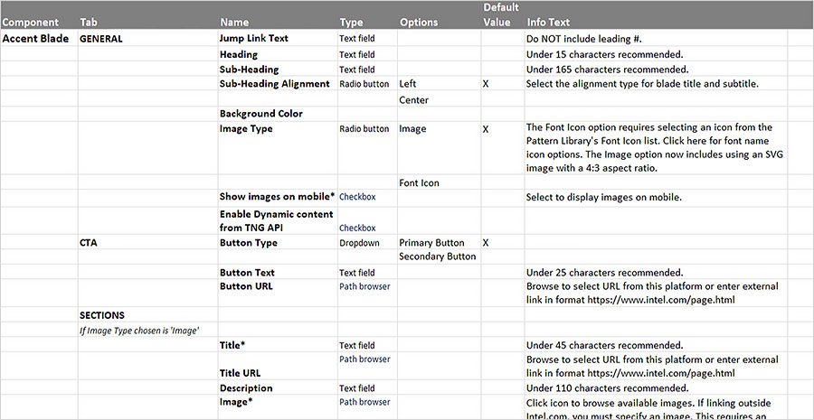
- Component audit: Reviewed over 80 components and dialogs to map inconsistencies, usage patterns, and constraints. Compiled a comprehensive spreadsheet documenting every dialog option for systematic comparison and standardization.
- Author interviews: Analyzed gaps between planned workflows and actual author needs to surface pain points and friction that data alone couldn’t reveal.
- Support data analysis: Mined office hours feedback and support ticket patterns to quantify the most impactful pain points.
- Workflow observation: Shadowed authors in their daily work to uncover hidden inefficiencies and the cognitive load driving workarounds.
Key Insights and Findings
Through comprehensive analysis, I identified seven critical failure points in the authoring experience:
Inconsistent naming conventions across 80+ components inflated cognitive load. Unclear tooltips generated confusion and errors. Cluttered interfaces surfaced irrelevant options across contexts. Missing organizational tools blocked efficient high-volume management. Absent required field indicators caused avoidable submission errors. Hidden content limits wasted hours of effort. Inconsistent terminology across teams undermined cross-functional collaboration.


Critical Discovery:
The dialog and tooling problems signaled something deeper than poor usability. They revealed systemic issues in system design and cross-team alignment that were undermining scalability and consistency across the entire authoring ecosystem.
Problems Found
20%
Time navigating inconsistencies
70%
Support tied to dialogs
125+
Active authors
Authors had built workarounds and informal networks to compensate, a clear signal that the official experience was failing to meet their needs.
Personas
Four distinct user groups, each facing unique friction points:
New Authors
Unclear onboarding processes and inconsistent patterns that don’t transfer across components slow ramp-up and erode confidence.
Power Users
Despite building workarounds, they lose efficiency navigating inconsistencies and struggle to scale their informal solutions to newer team members.
Occasional Authors
A frustrating authoring experience and difficulty remembering patterns drive them to avoid complex components entirely.
Cross-team Collaborators
Inconsistent terminology across design, development, and content teams creates communication barriers that slow alignment and delivery.
Ideation & Exploration
Design Thinking Process
With a clear map of four distinct user groups and their needs, I launched a structured ideation process targeting solutions that would serve all of them: new authors needing intuitive onboarding, power users demanding efficiency, occasional authors seeking simplicity, and cross-team collaborators requiring shared terminology.
I mapped each persona’s journey through the current authoring experience, pinpointing friction and opportunity. Through collaborative workshops with representatives from each group, I facilitated brainstorming sessions that generated targeted solutions. I then synthesized these into testable concepts through low-fidelity wireframes exploring different organizational structures and information hierarchies.
Alternatives Explored
I evaluated five distinct approaches to dialog standardization:
- Component-by-Component Redesign: Custom dialog solutions per component. Highly tailored but risked perpetuating inconsistencies and wouldn’t scale across 80+ components.
- Minimal Intervention: Fix only the most critical issues, such as broken patterns and missing tooltips, without comprehensive standardization. Faster to implement but wouldn’t resolve the systemic root causes.
- Framework-First: Build a comprehensive dialog design system with standardized patterns, naming conventions, and interaction models across all components. Higher upfront investment, but ensures consistency and scalability.
- Progressive Disclosure with Contextual Guidance: Layer smart display options on top of the framework approach, adjusting visible fields based on user selections and embedding contextual help. Serves both novice and expert users while reducing cognitive load.
- Hybrid Documentation Model: Integrate dialog specifications directly into the Pattern Library, creating a self-service resource that reduces support dependency while maintaining a single source of truth for authors and agencies alike.
Selected Approach
I chose a combined strategy integrating the Framework-First Approach with Progressive Disclosure and the Hybrid Documentation Model. This combination addressed all four user personas simultaneously:
- New authors gained consistent patterns that transfer across components.
- Power users gained efficiency through reduced clutter and smart contextual displays.
- Occasional authors received visual cues and embedded guidance for pattern retention.
- Cross-team collaborators operated from standardized terminology across design, development, and content.
Early validation confirmed this direction. Testing progressive disclosure patterns showed that hiding advanced options by default reduced cognitive load for new and occasional authors without frustrating power users, who quickly adapted to the expanded interaction patterns. Prototypes using standardized terminology also improved cross-functional communication during team meetings.
Working within AEM’s technical constraints required balancing the ideal user experience with platform feasibility. I focused on solutions implementable within AEM’s native dialog framework while still achieving significant usability gains. The selected approach delivered immediate implementability, scalability across 80+ components, and flexibility for future development, laying the groundwork for the design principles and standards framework detailed in the next section.
Design Process
I built a scalable framework first, then redesigned every dialog to align with it.
Design Principles
- Consistency: Standardized patterns and terminology across 80+ webpage complex UI components.
- Clarity: Action-oriented guidance at every step of the authoring workflow.
- Efficiency: Contextual interfaces that surface only relevant options.
- Empowerment: Individual Pattern Library pages for each dialog, creating self-service resources that reduce support dependency.
Information Architecture and Content Strategy
I mapped workflows to align with how authors actually think and create. Structured dialogs follow the natural content creation flow, starting with component options and their visual representation on the page, then narrowing to section-level choices.
Simplifying complex steps was central to the approach. Options only appear when a specific choice triggers them, eliminating cognitive load and visual clutter.
Design Standards Framework
I established comprehensive standards built to scale across all components:
- Field Naming Conventions: Consistent terminology across all dialogs. For example, “Heading” replaces the mix of “Title,” “Blade Title,” “Headline,” and “Header” that varied by component.
- Tooltip Guidelines: Contextual guidance that tells authors exactly what action to take.
- Interaction Pattern Rules: Consistent application of radio buttons and dropdowns across all dialogs.
- Visual Hierarchy Standards: Clear required fields, content limits, and error messaging.
- Content Guidance Integration: Character counts, formatting notes, and live previews embedded directly in the authoring flow.

Testing
Validation Methods
I ran extensive testing to validate that solutions addressed real author needs:
- Focus groups spanning new, experienced, and occasional authors
- Dialog wireframes with component-specific specifications
- Continuous feedback loops throughout the development process


Key Findings & Iterations
Validation surfaced critical insights that shaped the final solution:
- Authors needed more contextual guidance than initially scoped.
- Progressive disclosure proved essential for managing complex components.
- Terminology consistency had a significantly greater impact than anticipated.
- Clearly defined required fields and content limits measurably improved data quality.
Solution & Results
Final Design Solution
Comprehensive Dialog Standardization
- Unified field naming across 80+ components
- Contextual tooltips delivering clear, actionable guidance
- Smart options that surface based on content type and context
- Required indicators and inline content limits
- Integrated sorting and organization tools
Scalable Documentation System
- Pattern library with dialog wireframes
- Usage guidelines and best practices
- Onboarding resources blending principles with component specifics
- Searchable component reference

Strategic Implementation Approach
I executed a phased rollout prioritizing the most frequently used components. Author training supported effective change management. Continuous feedback loops drove iterative refinements, and cross-team protocols ensured consistency across the organization.
Quantitative Results
99%
Drop in dialog-related office hours
↓
Support tickets on authoring
↑
Workflow efficiency
↘
Onboarding time
Qualitative Impact
- Author confidence increased as complex components were no longer avoided.
- Shared terminology improved cross-team communication and alignment.
- Contextual guidance freed teams to focus on content quality over tool navigation.
- More precise requirements and well-defined capabilities elevated output quality.
- Eliminated design-to-implementation mismatches in external agency collaborations.
- Reduced client frustration and minimized project rework costs.
- Strengthened agency relationships through clear capability documentation.
Long-Term Organizational Benefits
- Established a foundation for scalable component development.
- Lowered maintenance costs through standardized implementations.
- Created a platform for personalization and workflow optimization.
- Improved author satisfaction and retention rates.
Reflection & Learnings
This project transformed the organization’s approach to internal experience design by recognizing content authors as essential users, driving significant improvements in productivity, satisfaction, and end-user content quality.
What Worked Well
- A comprehensive audit that uncovered systemic issues beyond surface-level usability problems
- Designing with content creators as primary users, not just end users, which improved the entire ecosystem
- Iterative testing that validated solutions against real usage patterns and author workflows
- Cross-functional collaboration that proved essential for adoption and long-term sustainability
- A scalable framework that could be applied consistently across 80+ components
Challenges Faced & How I Overcame Them
- Stakeholder Alignment: Connected authoring efficiency directly to end-user content quality, demonstrating that better internal tools produce better content for millions of visitors.
- AEM Constraints: Maximized usability within platform limitations through creative solutions that worked within what was technically feasible.
- Change Management: Trained authors without disrupting production through a phased rollout with continuous support.
- Resourcing: Built the business case for behind-the-scenes improvements by quantifying time savings and support overhead reduction.
What I Would Do Differently
- Start with more granular user research to surface edge cases earlier in the process.
- Involve developers in the initial audit phase for a more comprehensive technical feasibility assessment.
- Establish formal metrics tracking from the outset to quantify improvements more precisely.
Key Strategic Insights
- Internal users drive organizational success. This project proved that treating content authors as essential stakeholders whose productivity directly impacts end-user experience produces measurable business value. The 99% reduction in support requests and significant decrease in onboarding time validated this approach.
- Systems Thinking as Differentiator: My ability to integrate UX design, technical systems, and content strategy enables me to look beyond individual component fixes and identify the systemic standardization needed. This holistic perspective produces solutions that address immediate pain points while ensuring long-term scalability.
- Documentation as Strategic Design Tool: The standardization framework established a foundation for scalable component development and demonstrated that documentation is a strategic design tool, not just a deliverable. This framework became a template for other Intel.com initiatives, proving how strategic UX thinking drives systematic process improvements that bridge silos between design, development, and content teams while preserving institutional knowledge.
Behind every exceptional user experience is a team of empowered content creators working with tools designed for their success.


